Canada Goose Back in Stock Email
Redesign
A email refresh for a frictionless experience for shoppers.
_________________________________________________________________
Contributors
Digital Marketing CRM, Customer Experience
_________________________________________________________________
Skills
Research, UI, UX, Visual design, Branding, Prototyping
_________________________________________________________________
Timeline
9 weeks
Overview
Back in Stock emails are one of the best performing communications with the highest revenue per email with an open rate of 65% and conversion rate of 18%. It has the power to draw back lost revenue back to the bottom line of the business. These email alerts serve as a key buying signal and tool to close in on the gap by targeting those who have shown a direct interest in making a purchase.
Being a part of Canada Goose's Digital Marketing CRM team, I saw the opportunity and responsibility to enhance Canada Goose’s Back in Stock notification emails by providing key information shoppers need to complete the customer journey.
The problem
Back in Stock emails are exciting to see in your inbox. It’s a race to purchase what you've been looking for before it’s gone again.
However, this could be frustrating for customers who expect online purchases to be on demand but aren’t clear with the details of the item they signed up for restock alerts some time ago. Without an optimized out of stock follow up system, customers will be driven elsewhere and could have a long-term impact on customer satisfaction caused by a poor experience.
When I was in the market to look for a new winter parka for the season, I signed up for Canada Goose’s email alerts for multiple sizes of a single style. When I received and opened the email, I was confused by the lack of key information I needed to follow through the call to action (CTA) and make a purchase. As a customer and being responsible for this email at Canada Goose, I decided to take this matter to my team to make improvements.
Design challenge
How might we improve Canada Goose’s existing Back in Stock email to allow customers complete a purchase quicker and easier?
Business goals
1. Relevance
Provide item details that will provide all the information a shopper needs to make a purchase when they get a Back in Stock email. The email only provided the product name and photo with no specific details relevant to the potential buyer such as the colour and size they signed up for the notification.
2. Helping customers decide
Product suggestions are also a great tool to relieve some of the impatience of customers experienced during a peak season by redirecting them to other styles similar to the one they signed up for.
The solution
In order to improve conversions on BIS emails, we:
1. Created an email that is timely, personal and informative.
2. Provided size and colour descriptions of the item.
3. Included relevant product recommendations to encourage engagement if they lost interest in the out of stock item.
Measuring success
1. Customer follows through "Shop Now" CTA and purchases item in the Back in Stock email.
2. Customer browsed "You may like" section in the Back in Stock email and purchases suggested product instead.
3. Click to Open Rate (CTOR) increases from historic benchmarks.
Approach
1. Research
🍊 User interviews
🍊 Personas
2. Ideation
🍊 Brainstorming
🍊 Layout exploration
🍊 Wireframes
3. Prototype
🍊 Iteration
🍊 High-fidelity
Understanding Our Customers
Although my experience as a customer myself could have easily provided me with enough insight to propose various solutions to the problems I encountered, I didn’t want my research to be weighted only on my perspective. I sought to gain insight from others to validate if they experienced the same issues as well.
Given the time restraints, I conducted our user research by gathering insights from previous customers. I surveyed 4 customers for feedback and conducted 3 semi-structured interviews. Here are some insights I gained from the conversations:
1. Peak winter parka sales start in October through December. As a result, shoppers are two times more likely to sign up for Back in Stock email notifications for popular styles that sell out during this time.
2. Many customers sign up for alerts for more than one size of a particular style. When shopping for a winter parka online, more than one size is ordered because customers try them on to see which one fits best.
3. When shoppers receive our email notification, they are unsure as to which size and colour is back in stock. After clicking the call to action in the email and finding out that their desired product is unavailable, they are left even more frustrated and disappointed.
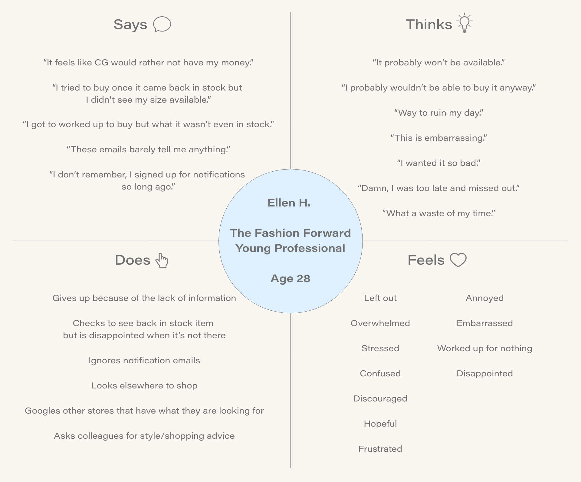
Empathy map
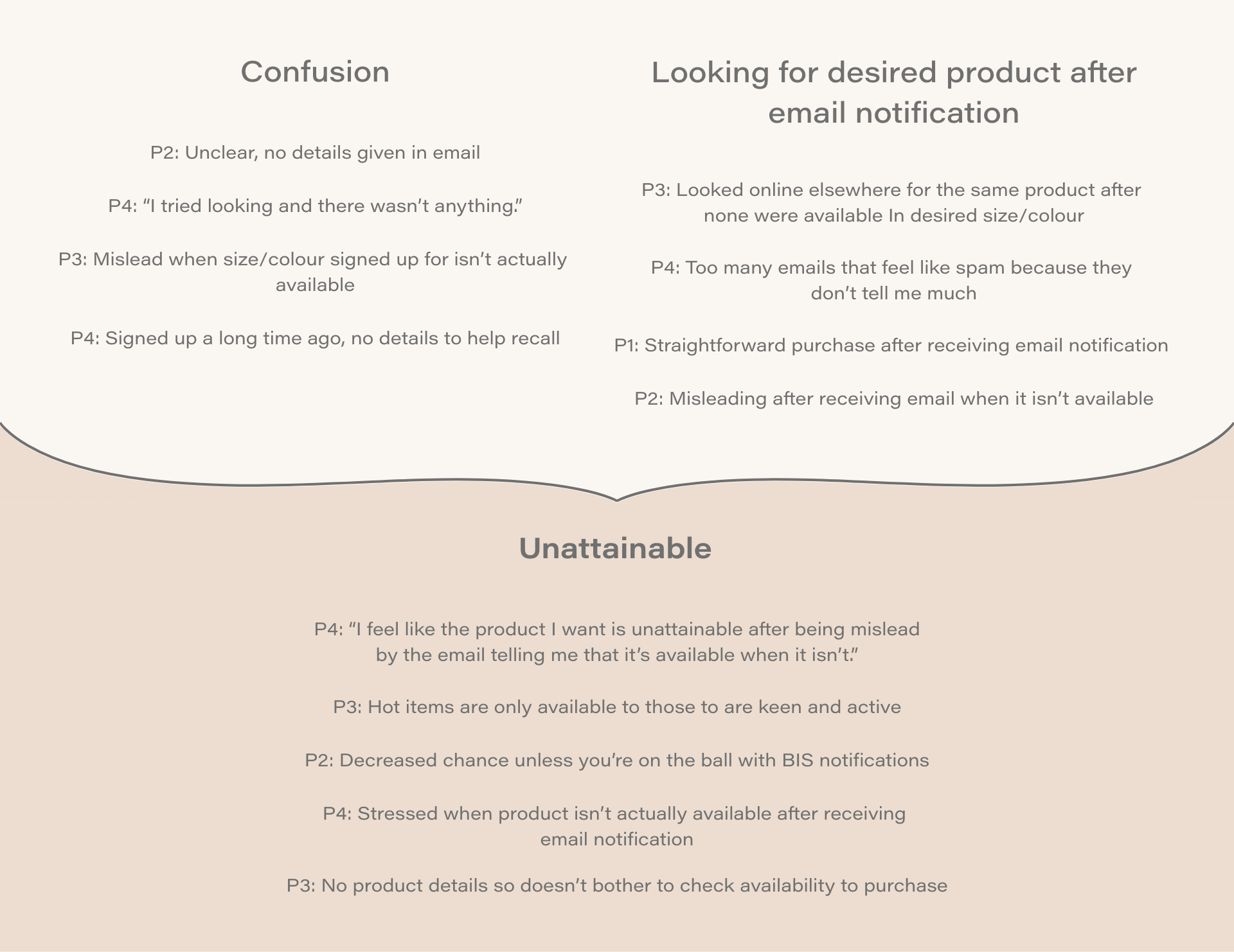
Interview affinity diagram
User flow
To help guide the design process, we mapped the journey of our customer through a User Flow of our Back in Stock email. This allowed us to narrow in our goal of getting shoppers to make purchase after receiving the notification.
To help guide the design process, we mapped the journey of our customer through a User Flow of our Back in Stock email. This allowed us to narrow in our goal of getting shoppers to make purchase after receiving the notification.
Brainstorming
After collecting insights from our research, we used our persona and reflected on our current email to address features what users wanted to implement into our Back in Stock email.
We noticed from our competitors' Back in Stock email did not detail size and colour. So we asked ourselves, how might we make a Back in Stock notification email to provide the necessary product details needed to make an informed purchase for customers?
This was the list of items I considered to include in our Back in Stock email to help us achieve the goal for this redesign:
• Product style name
• Size
• Color
• Price
• Style number
• Number of shoppers who also wanted the item
• Product suggestions
Email layout exploration
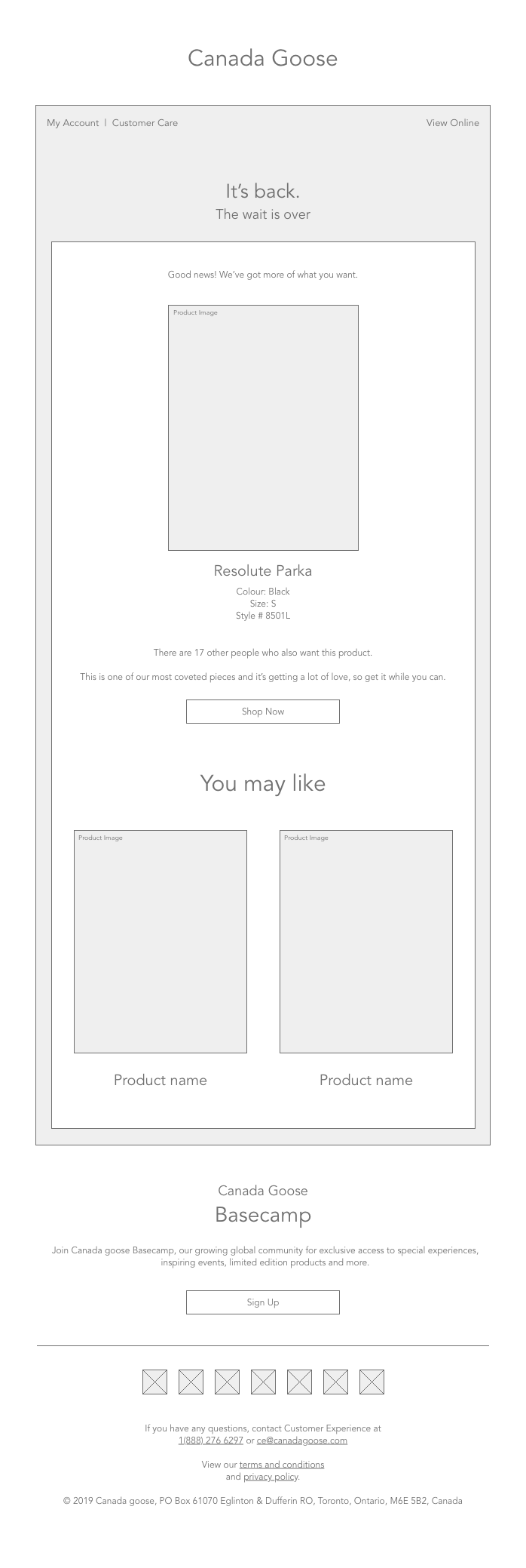
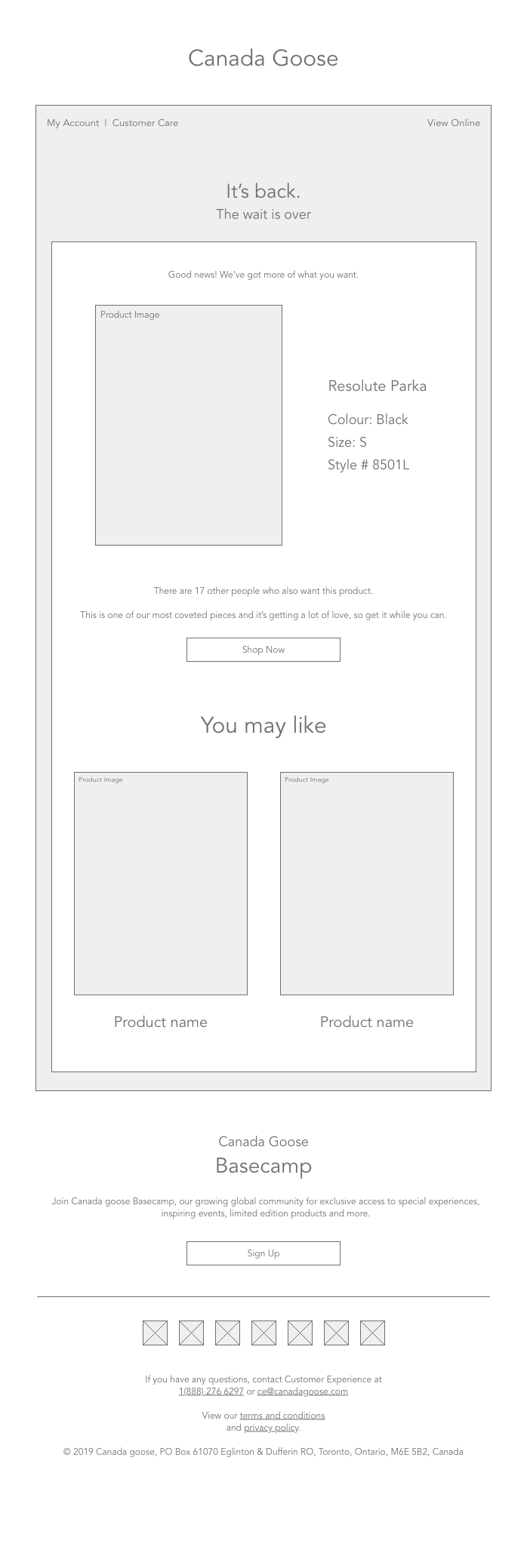
After curating our Back in Stock email features with our user research, I created different layout iterations. When developing our wireframes, I put emphasis on typography and image hierarchy in terms of how the user digests the information in sections. It was also important for us to create a responsive layout that would work across different screen formats.
Final design
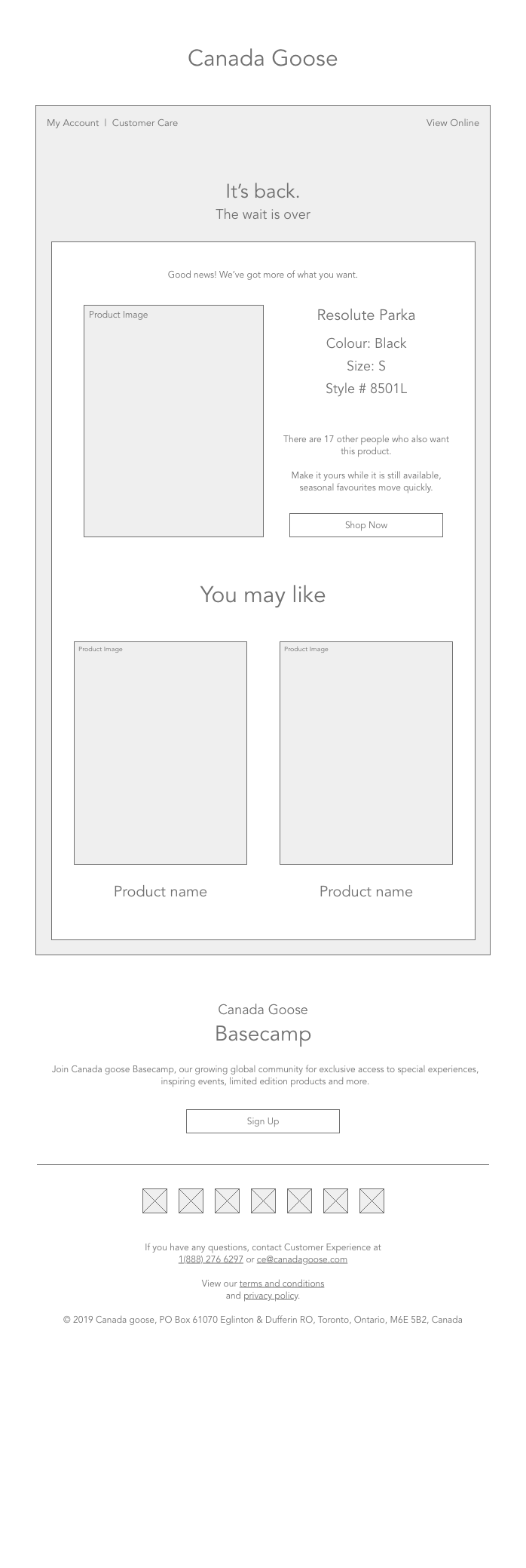
A/B Testing was done for the top two iterations of the Back in Stock email. The final design had the best performing CTOR and number of purchases through the CTA against the two other emails tested.
We kept things concise by including the key information customers such as the colour, size, style number and the number of others who also signed up for the same item to facilitate customers to make quick purchasing decisions. By the time the item that was signed up for the notification no longer interests the customer or is not available the moment they open the email, we provided product recommendations at the bottom.
We kept things concise by including the key information customers such as the colour, size, style number and the number of others who also signed up for the same item to facilitate customers to make quick purchasing decisions. By the time the item that was signed up for the notification no longer interests the customer or is not available the moment they open the email, we provided product recommendations at the bottom.
Customer feedback
“It’s great that I can immediately purchase what I’ve been eyeing weeks ago. Most of the time I don’t remember which size I signed up for so it’s nice to buy it upfront without having to look at the measurements guide again.”
“Most of the styles I want are sold out in my size. I sign up for Back in Stock notifications for different sizes. Having product details in the email makes it super easy to purchase and not miss out.”
Outcome
The email resulted in a 30% increase in conversions with the updated design. That brought our conversion rate to 24%, which is a 6 percent increase from the industry benchmark.
Reflection
The project was a collaboration between the CRM and UX teams from start to finish with a narrow timeline. Every stage involved extensive teamwork and input from managers and external teams. It was a valuable learning experience to tackle how to incorporate extensive feedback from users and stakeholders to improve the project iteratively.
I gained a true appreciation for the benefits of diverse opinions and experiences to help craft a truly people-centered solution. As a result, I learned the importance of being purposeful and utilizing story-telling as essential tools to communicate design decisions to diverse stakeholders.


